Creating an intuitive account management hub by integrating a unified design system
Overview
As a result of the App Analysis Research Report, the engineering team agreed to implement a phased re-platforming approach to convert key user flows from web-wrapped to native development. This strategic shift would directly address the fragmented, inconsistent experience that was driving customer frustration, support calls, and ultimately churn.
My responsibilities
Strategy oversight and delivery
Information architecture
Wireframing
Visual and interaction design
Opportunity
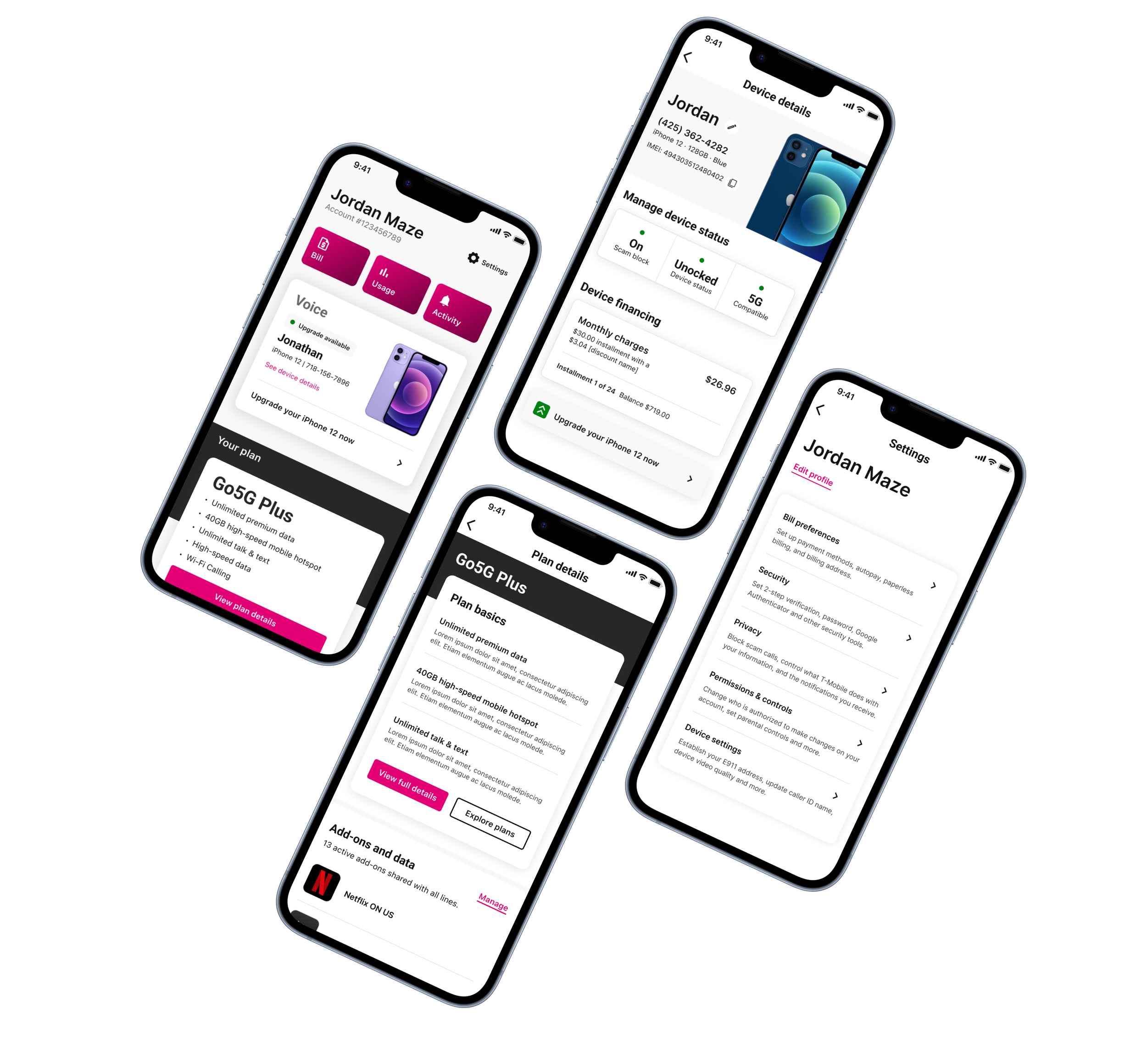
I led a team of two designers to identify the top four areas for native app development with consideration towards solving both user problems and keeping within technical feasibility. The redesign focused on four key areas: account landing, plan management, device information, and settings.
85%
Of these four areas of the app were web-wrapped, leading to an opportunity to utilize native OS patterns and components.
30%
Of reported app issues were tied to navigation. This redesign aimed to connect more intuitive experiences with increased task success rates.
PROFILE AND SETTINGS
PLAN BENEFITS
ACCOUNT LANDING
DEVICE DETAILS
App performance: a growing customer painpoint
With technical issues being the top pain point for these identified 4 areas, the app’s slow responsiveness and page-loading times were negatively impacting customer satisfaction (according to in-app surveys).
To uncover qualitative insights, we conducted discovery sessions and analyzed existing research, which included usability tests and surveys.

Detailed design feedback was provided for each identified task flow, addressing accessibility, UI inconsistencies, and visual design improvements like hierarchy and typography.
Recommended improvements
Replace radio buttons, check boxes, and accordions.
Establish better hierarchy with categories.
Add in SIM, IMEI and device model information
Remove payment estimator (contingent on what the metrics are).
Convert the extra device payment the native payments design.
Provide easy access to relevant billing tasks (example, account activity).
ACTION
From concept to wireframe: accelerating mobile app design through teamwork
In an effort to move fast and get everyone on the same page, I led two designers in a series of hands-on co-design sessions with the product groups. We weren’t aiming for perfection at this stage; it was all about getting rough wireframes down, making sure they matched the requirements, and figuring out any roadblocks or questions that needed to be addressed. It was a fast-paced collaboration, but this diverse team led by design was able to map content blocks together, figure out the visual hierarchy, and explore different mobile app patterns.
ACCOUNT LANDING
Hub and spoke layout
Re-organization of the page brought the most frequently accessed account management tasks, such as viewing billing information, managing subscriptions, and updating profile details to the forefront.
Contextual settings
This list dynamically displays relevant and important items for users to set up, eliminating the need to dig through multiple menus or screens.
DEVICE DETAILS
Easier access to device financing
Improved the visibility and accessibility of options, empowering customers to manage their payments and explore available programs with ease.
Self-service tools to resolve issues
Centralized hub for device-related information and troubleshooting tools, making it easier to find solutions to common problems.
Opportunity
This initiative coincided with the development of a centralized design system. We collaborated very closely with the component library experts so that we had guidance on how to build off of the foundational elements and patterns that were available.
Action
I orchestrated the UI collaboration across the multiple teams to ensure it went smooth and that the components created were both feasible and consistent with the evolving design system.
DESIGN SYSTEM FOUNDATIONAL ELEMENTS EXAMPLE
Rapid prototyping utilized to validate concepts faster
To ensure rapid progress, we incorporated frequent, lightweight usability tests for immediate design feedback.
MID-FIDELITY WIREFRAMES
Outcomes & impact
By leveraging visual design principles, we collectively explored ways to breathe life into previously mundane interfaces. This collaborative approach was instrumental in overcoming the challenges posed by the app's web-wrapped structure and scattered information architecture.
Together, we created a shared vision for a more intuitive, visually appealing experience that aligned with T-Mobile's new design system. The process not only yielded a superior product but also fostered a culture of open communication and shared ownership among team members, setting a new standard for cross-team collaboration in future projects.
15%
Reduction in account management support calls to customer care within 3 months of launch, saving an estimated $2.5 million annually in operating costs.
40%
Decrease in time on task as result of the streamlined navigation and information architecture.
22%
Increase in task completion for billing, payment, profile and security categories.
50%
Forecasted growth in positive sentiment across key usability metrics, including reduced perceived effort, faster task completion times, and improved ease of navigation.